Plainer Jane #3, Reviewed
Reading time: 5 minutes

How about a return to the easy to lose in a crowd girl with the unmistakable talent for making people well deaded with alley based murderising in splashed with red, black and white art? Of course, it’s David Wilburn’s Plainer Jane #3.
Broken Face comics have regaled and entertained with the macabre adventures of the plainest of Janes. The real-world storytelling is so effective because it is set in the real world.
Manchester to be precise. In doing so we readers get two cool consequences. Firstly that the story feels that much more grounded, there's that homely feeling when you open these pages because you're stepping into an easy to recognise world. It’s unmistakable and adds to the engrossing nature as you're sucked back into the wholly familiar. The second Brucie bonus comes from the fact we get awesome rear covers from Donna Anita Black giving an always elegant exclamation point steeped in history to each issue, but we’ll get into that soon enough. It’s important to note for having that touch of recognisable realism and rich history which often goes underutilized. British indie comics from indie publishers. It’s what we love.

So, let’s start with the art. As with previous issues, there's a run down to get through from the team of art assassins that is Ralf Singh, Wayne Lowden, Donna Anita Black and Tim West. There's also a guest artist on this issue thanks to a super stretch goal of a short story from the very talented Guiseppe Sabé Di Stefano.
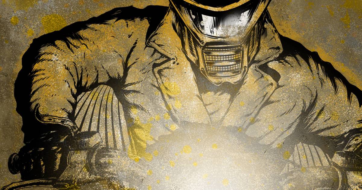
First off it’s Ralf Singhs unmistakably styled front cover which has established itself at this point as the harbinger of the darkly comic antics of Plainer Jane. The split-page format delivers once again on the contrasting dual nature of Jane. There's a strong tang of sadness to this one compared to the previous two with a theme shift of sorts. This one is less of a commentary on Jane other than the dual of death bringer and caregiver but perhaps a bigger commentary on death. There are worse ways to go than being stabbed in an alley as excellently depicted in this case. It’s another cracking cover accentuated by the Tim West logo which is second to none. While we’re talking about Tim the lettering again is absolutely on point keeping this comic such an enjoyable experience.
Speaking of experience Donna’s art is twice as nice this time around as not only do we end on that macabre Manchester music influenced stunner back page. The subject of which is Fac 51, Haçienda club which I believe before being flattened and replaced with flats was considered the birthplace of Acid House as well as a thriving venue for a variety of Manchester music alumni including Britpop and new wave. The extra inclusion of graffiti sporting the slogan of the political group, Situationist International which in fact inspired the name, adds an extra level of importance to this piece of art. The other extra Donna bonus comes from a two-page story of the tale of Robert Johnson and the crossroads and the escapism power of music presented in Donna’s mixed-media style of haunting beauty.
After this intro, it's the guts of the art as Wayne brandishes his skills on sequential art. The art that never disappoints. The characters hit emotions hard across the full spectrum from the heartache of a man at a hospital bedside to the anger of Jane's violence or lighthearted piss talk. Even deviant alley behaviour packs a punch in this expert art. It’s Wayne’s capture of Manchester's streets and settings that keep things grounded in a gritty puddle that develops from the more light-hearted intro and clinical surroundings. Ralph's colours are devilish again as exclamation points of enhancement. And finally, it’s a newcomer to the series Giuseppe on the stretch goal unlocked short story. The art is a mix of whimsical and kooky like a Tim Burton sponsored kids cartoon in frantic sketch lines and a bold yellow lens filtered palette. It suits the memory aesthetics really well and is a great extra bonus.

So it’s time for the story. David Wilburn’s Plainer Jane deserves the expertly executed art that supports it. The previous issues have established a captivating character in an engrossing world. The real-world locations and explorations of Jane as a character leaving student classrooms for workplace training add to that strong grounded foundation. The irony of the pursuit of nursing adds a mirthful tang while the interactions and opening scenes create the typical laugh-inducing first half that readers of the series would expect. Particularly the superhero conversation which I really enjoyed.
Plainer Jane the comic is a delivery of dual narratives from front cover to back in art, in character and in story. They say there are two sides to every story, well Plainer Jane is intrinsically so. Just like the cover, there's always the midpoint shift from the Jane the world sees to the Jane that’s true to her nature. Previous issues have wonderfully executed the establishment of Janes predisposition and proficiency in the art of dispatching mortal coils.
As she navigates teenage life and makes tentative steps into a conventional career, she continues to make huge strides in her preferred field. This third issue is taking this well-established character and pushing the overall plot up a major gear in a shift that not only shows Jane turning pro on Plainstorm with a steady repeat business client but that also, thanks to some nefarious scar-faced delivered tree metaphors, Jane is bunking off a higher class of target. Targets that may come back to bite her hard. Harder than a dog through a chainlink fence at least. The steaks are ramping up and this one deserves to not be spoiled.
David shows with this issue that not only can he create an engrossing lead character with a wealth of narrative background, but he can also set up a most intriguing affair and hard-driven story that I’ve fully bought into. It’s also worth mentioning that Guiseppe bonus story serves not only as an excellent origin story for Kat and Jane but also sees David flex technical chops with a fully Haiku based narrative showing deviant levels of talent.
For fans of darkly comic entertainment, strong fully realised female leads, dark web-based murder for hire, scar-faced, tree metaphor spouting villains, clandestine hooded employers, back alley murderising, Super Jeff the fat bastard and super piss nurse - it’s Plainer Jane we should all be reading. All current issues are available at https://www.brokenfacecomics.com/ and issues four and five will be released through Kickstarter on November 4th so get your reminders set. With a promise of seven total issues this almost midpoint is a great opportunity to get caught up and onboard a promising series.
Rating: reaching 5/5
Support Us
Enjoyed this article?
Supporting us on Ko-fi helps keep Comic Book News UK running and lets us continue championing indie comic creators across the UK. Every contribution makes a real difference.
100% goes towards supporting indie creators